> ## Documentation Index
> Fetch the complete documentation index at: https://docs.liv.tv/llms.txt
> Use this file to discover all available pages before exploring further.
# UI Components
> Overview of the LCKUI 3D component library for VR touch interaction in Unreal Engine, including buttons, toggles, steppers, displays, and styling with the LIV Camera Kit (LCK) SDK.
**Module:** LCKUI | **Version:** 1.0 | **Platforms:** All
## Overview
LCKUI provides a comprehensive 3D UI component library designed for VR touch interaction. Components feature touch-based input, visual state management, and material-driven styling optimized for immersive environments.
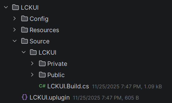 ## Component Hierarchy
```
USceneComponent
└── ULCKBaseButton (ILCKButtonable, ILCKShowable)
├── ULCKToggle
│ ├── ULCKRectToggle
│ ├── ULCKFollowButton
│ ├── ULCKMicButton
│ └── ULCKScreenOrientationButton
├── ULCKStepper
│ ├── ULCKFOVButton
│ ├── ULCKDistanceButton
│ └── ULCKSmoothnessButton
├── ULCKRectButton
│ └── ULCKFlipButton
├── ULCKPad2D
├── ULCKRecordButton
├── ULCKVideoQualityButton
└── ULCKOnScreenButton
├── ULCKOnScreenFlipButton
└── ULCKOnScreenPhotoButton
```
## Key Components
Base class for all UI buttons with touch interaction and visual states
On/off toggle button with state-dependent icons
Increment/decrement control for numerical values
Render target display surface with overlay effects
## Button Types
Standard icon button for actions and toggles.
**Box Extent:** (0.4, 2.4, 2.4)
**UV Step:** (0.1, 0.1)
```cpp theme={null}
ULCKBaseButton* Button = CreateDefaultSubobject(TEXT("MyButton"));
Button->ButtonType = ELCKButtonType::Square;
```
Wide button for text labels and multi-action controls.
**Box Extent:** (0.4, 6.0, 2.4)
**UV Step:** (0.25, 0.1)
```cpp theme={null}
ULCKRectButton* Button = CreateDefaultSubobject(TEXT("WideButton"));
```
Tab-shaped button for mode selection.
**Box Extent:** (0.4, 4.4, 2.4)
**UV Step:** (0.183333, 0.1)
Top selector for dropdowns and menus.
**Box Extent:** (2.4, 4.4, 0.8)
## Quick Example
```cpp theme={null}
#include "LCKBaseButton.h"
#include "LCKToggle.h"
void AMyActor::SetupUI()
{
// Create a toggle button
ULCKToggle* MicToggle = CreateDefaultSubobject(TEXT("MicToggle"));
MicToggle->SetupAttachment(RootComponent);
// Set toggle icons
MicToggle->ToggleOnIcon = MicOnTexture;
MicToggle->ToggleOffIcon = MicOffTexture;
// Bind to tap event
MicToggle->OnTapStarted.AddDynamic(this, &AMyActor::OnMicToggleTapped);
}
void AMyActor::OnMicToggleTapped()
{
bIsMicOn = !bIsMicOn;
MicToggle->UpdateVisuals(bIsMicOn);
}
```
## Interfaces
### ILCKButtonable
Marker interface for button-like objects that can be pressed.
### ILCKShowable
Visibility control interface for show/hide operations.
```cpp theme={null}
class ILCKShowable
{
public:
virtual void Show() = 0;
virtual void Hide() = 0;
};
```
### ILCKRecordable
Recording state interface for record button components.
```cpp theme={null}
class ILCKRecordable
{
public:
virtual void SetTime(float NewTime) = 0;
virtual void UpdateVisuals(const ELCKRecordingState NewState) = 0;
};
```
## Styling
### Color Palette
The SDK provides a consistent color palette via `FLCKColor`:
| Color | RGB | Usage |
| --------------- | --------------- | -------------------- |
| `Primary` | (8, 8, 8) | Main background |
| `PrimaryText` | (220, 220, 220) | Primary text |
| `ButtonDefault` | (40, 40, 40) | Button background |
| `ButtonActive` | (94, 69, 255) | Active/pressed state |
| `Alert` | (255, 42, 42) | Recording indicator |
| `Success` | (32, 196, 64) | Success state |
### Constants
```cpp theme={null}
struct FLCKConstants
{
static constexpr float CoolDownTime = 0.25f; // Button cooldown
inline static const FName UICollisionProfileName = TEXT("OverlapOnlyPawn");
};
```
## Log Category
```cpp theme={null}
DECLARE_LOG_CATEGORY_EXTERN(LogLCKUI, Log, All);
```
## Next Steps
Button components
Advanced controls
Theming and styling
## Component Hierarchy
```
USceneComponent
└── ULCKBaseButton (ILCKButtonable, ILCKShowable)
├── ULCKToggle
│ ├── ULCKRectToggle
│ ├── ULCKFollowButton
│ ├── ULCKMicButton
│ └── ULCKScreenOrientationButton
├── ULCKStepper
│ ├── ULCKFOVButton
│ ├── ULCKDistanceButton
│ └── ULCKSmoothnessButton
├── ULCKRectButton
│ └── ULCKFlipButton
├── ULCKPad2D
├── ULCKRecordButton
├── ULCKVideoQualityButton
└── ULCKOnScreenButton
├── ULCKOnScreenFlipButton
└── ULCKOnScreenPhotoButton
```
## Key Components
Base class for all UI buttons with touch interaction and visual states
On/off toggle button with state-dependent icons
Increment/decrement control for numerical values
Render target display surface with overlay effects
## Button Types
Standard icon button for actions and toggles.
**Box Extent:** (0.4, 2.4, 2.4)
**UV Step:** (0.1, 0.1)
```cpp theme={null}
ULCKBaseButton* Button = CreateDefaultSubobject(TEXT("MyButton"));
Button->ButtonType = ELCKButtonType::Square;
```
Wide button for text labels and multi-action controls.
**Box Extent:** (0.4, 6.0, 2.4)
**UV Step:** (0.25, 0.1)
```cpp theme={null}
ULCKRectButton* Button = CreateDefaultSubobject(TEXT("WideButton"));
```
Tab-shaped button for mode selection.
**Box Extent:** (0.4, 4.4, 2.4)
**UV Step:** (0.183333, 0.1)
Top selector for dropdowns and menus.
**Box Extent:** (2.4, 4.4, 0.8)
## Quick Example
```cpp theme={null}
#include "LCKBaseButton.h"
#include "LCKToggle.h"
void AMyActor::SetupUI()
{
// Create a toggle button
ULCKToggle* MicToggle = CreateDefaultSubobject(TEXT("MicToggle"));
MicToggle->SetupAttachment(RootComponent);
// Set toggle icons
MicToggle->ToggleOnIcon = MicOnTexture;
MicToggle->ToggleOffIcon = MicOffTexture;
// Bind to tap event
MicToggle->OnTapStarted.AddDynamic(this, &AMyActor::OnMicToggleTapped);
}
void AMyActor::OnMicToggleTapped()
{
bIsMicOn = !bIsMicOn;
MicToggle->UpdateVisuals(bIsMicOn);
}
```
## Interfaces
### ILCKButtonable
Marker interface for button-like objects that can be pressed.
### ILCKShowable
Visibility control interface for show/hide operations.
```cpp theme={null}
class ILCKShowable
{
public:
virtual void Show() = 0;
virtual void Hide() = 0;
};
```
### ILCKRecordable
Recording state interface for record button components.
```cpp theme={null}
class ILCKRecordable
{
public:
virtual void SetTime(float NewTime) = 0;
virtual void UpdateVisuals(const ELCKRecordingState NewState) = 0;
};
```
## Styling
### Color Palette
The SDK provides a consistent color palette via `FLCKColor`:
| Color | RGB | Usage |
| --------------- | --------------- | -------------------- |
| `Primary` | (8, 8, 8) | Main background |
| `PrimaryText` | (220, 220, 220) | Primary text |
| `ButtonDefault` | (40, 40, 40) | Button background |
| `ButtonActive` | (94, 69, 255) | Active/pressed state |
| `Alert` | (255, 42, 42) | Recording indicator |
| `Success` | (32, 196, 64) | Success state |
### Constants
```cpp theme={null}
struct FLCKConstants
{
static constexpr float CoolDownTime = 0.25f; // Button cooldown
inline static const FName UICollisionProfileName = TEXT("OverlapOnlyPawn");
};
```
## Log Category
```cpp theme={null}
DECLARE_LOG_CATEGORY_EXTERN(LogLCKUI, Log, All);
```
## Next Steps
Button components
Advanced controls
Theming and styling