LCK UI components are fully customizable to match your game’s art style and feel.

Overview

The LCK UI system supports customization of:
  • Materials - Button colors, textures, and visual effects
  • Sounds - Button press/release audio feedback
  • Haptics - Controller vibration feedback

Material Customization

Button Materials

LCK buttons use material instances for visual states:
StateDescription
DefaultNormal idle appearance
HoveredPointer/hand over button
PressedButton being pressed
DisabledButton inactive

Customizing Materials

1

Locate Default Materials

Find the default materials in:
Plugins/LCKUI/Content/Materials/
├── M_LCKButton_Base
├── MI_LCKButton_Default
├── MI_LCKButton_Recording
└── MI_LCKButton_Disabled
2

Create Material Instances

Create new Material Instances based on M_LCKButton_Base:
  1. Right-click M_LCKButton_Base
  2. Select Create Material Instance
  3. Name it (e.g., MI_MyGame_Button)
3

Customize Parameters

Adjust material parameters:
ParameterTypeDescription
BaseColorColorPrimary button color
EmissiveColorColorGlow color
EmissiveIntensityFloatGlow brightness
OpacityFloatTransparency
4

Apply to Components

Assign your custom material to LCK button components:
ULCKButton* Button = FindComponentByClass<ULCKButton>();
Button->SetMaterial(MyCustomMaterial);

Emission & Lighting

Depending on how you use real-time lighting in your game you might want to tweak emission strength on the UI materials.
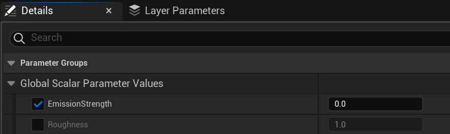
 Material emission settings

UI Texture Assets

UI visuals are defined by the UITexture asset. Update it to change the UI look. Update LCKTabletTexture asset to change how the tablet looks. UITexture assets

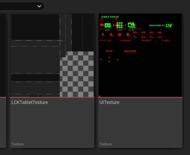
Material Parameter Updates

LCK automatically updates material parameters based on state:
// How LCK updates button materials internally
void ULCKButton::UpdateMaterialState(ELCKButtonState NewState)
{
    if (DynamicMaterial)
    {
        switch (NewState)
        {
            case ELCKButtonState::Default:
                DynamicMaterial->SetVectorParameterValue(TEXT("Color"), DefaultColor);
                break;
            case ELCKButtonState::Hovered:
                DynamicMaterial->SetVectorParameterValue(TEXT("Color"), HoverColor);
                break;
            case ELCKButtonState::Pressed:
                DynamicMaterial->SetVectorParameterValue(TEXT("Color"), PressedColor);
                break;
        }
    }
}

Sound Feedback

TabletDataModel has a broadcast for a UI element being pressed. You can subscribe your own implementation to it. OnUIElementPressed broadcast

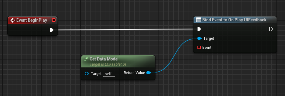
Configuring Button Sounds

LCK buttons can play sounds on interaction:
UPROPERTY(EditAnywhere, Category = "Audio")
USoundBase* PressSound;

UPROPERTY(EditAnywhere, Category = "Audio")
USoundBase* ReleaseSound;

UPROPERTY(EditAnywhere, Category = "Audio")
USoundBase* HoverSound;

Setting Up Sounds

  1. Select the LCK button component
  2. In Details panel, find Audio section
  3. Assign your sound assets to:
    • Press Sound
    • Release Sound
    • Hover Sound

Sound Volume

Adjust UI sound volume relative to game audio:
Button->SetSoundVolume(0.5f);  // 50% volume

Haptic Feedback

Controller Vibration

LCK supports haptic feedback for VR controllers:
UPROPERTY(EditAnywhere, Category = "Haptics")
float PressHapticIntensity = 0.5f;

UPROPERTY(EditAnywhere, Category = "Haptics")
float PressHapticDuration = 0.1f;

Configuring Haptics

void UMyComponent::SetupHaptics()
{
    ULCKButton* Button = FindComponentByClass<ULCKButton>();

    // Configure press haptics
    Button->SetPressHaptics(
        0.7f,   // Intensity (0-1)
        0.05f   // Duration in seconds
    );

    // Configure hover haptics
    Button->SetHoverHaptics(
        0.2f,   // Lighter intensity for hover
        0.02f
    );
}

Platform-Specific Haptics

Quest controllers support:
  • Amplitude modulation
  • Frequency control
  • Duration timing
// Quest-specific haptic pattern
FHapticFeedbackDetails_Curve HapticPattern;
HapticPattern.Frequency = 0.5f;
HapticPattern.Amplitude = 0.8f;

APlayerController* PC = GetWorld()->GetFirstPlayerController();
PC->PlayHapticEffect(HapticPattern, EControllerHand::Right);

Widget Styling

Text Customization

UPROPERTY(EditAnywhere, Category = "Text")
FSlateFontInfo LabelFont;

UPROPERTY(EditAnywhere, Category = "Text")
FLinearColor LabelColor;

Icon Customization

Replace button icons with your own:
UPROPERTY(EditAnywhere, Category = "Icons")
UTexture2D* RecordIcon;

UPROPERTY(EditAnywhere, Category = "Icons")
UTexture2D* StopIcon;

UPROPERTY(EditAnywhere, Category = "Icons")
UTexture2D* CameraIcon;

Theme Presets

Create reusable theme configurations:
USTRUCT(BlueprintType)
struct FLCKUITheme
{
    GENERATED_BODY()

    UPROPERTY(EditAnywhere)
    FLinearColor PrimaryColor;

    UPROPERTY(EditAnywhere)
    FLinearColor SecondaryColor;

    UPROPERTY(EditAnywhere)
    FLinearColor AccentColor;

    UPROPERTY(EditAnywhere)
    USoundBase* ButtonPressSound;

    UPROPERTY(EditAnywhere)
    float HapticIntensity;
};

// Apply theme to all LCK UI
void ApplyTheme(const FLCKUITheme& Theme)
{
    TArray<ULCKButton*> Buttons;
    GetOwner()->GetComponentsByClass<ULCKButton>(Buttons);

    for (ULCKButton* Button : Buttons)
    {
        Button->SetDefaultColor(Theme.PrimaryColor);
        Button->SetPressedColor(Theme.AccentColor);
        Button->SetPressSound(Theme.ButtonPressSound);
        Button->SetPressHapticIntensity(Theme.HapticIntensity);
    }
}

Best Practices

Customize the tablet to feel native to your game world:
  • Use your game’s color palette
  • Match button styles to existing UI
  • Consider environmental theming (sci-fi, fantasy, etc.)
Ensure feedback is consistent across all LCK interactions:
  • Same sound volume for all buttons
  • Similar haptic intensity
  • Consistent visual transitions
Always test customizations on actual VR hardware:
  • Verify materials look correct in VR
  • Test haptic intensity
  • Confirm sound spatialization
Consider accessibility when customizing:
  • High contrast color options
  • Adjustable haptic intensity
  • Optional sound feedback toggle

See Also