

Module: LCKUI | Version: 1.0 | Platforms: All
Overview
LCKUI provides a comprehensive 3D UI component library designed for VR touch interaction. Components feature touch-based input, visual state management, and material-driven styling optimized for immersive environments.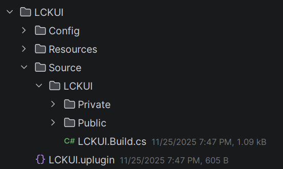
Component Hierarchy
Key Components
ULCKBaseButton
Base class for all UI buttons with touch interaction and visual states
ULCKToggle
On/off toggle button with state-dependent icons
ULCKStepper
Increment/decrement control for numerical values
ULCKDisplay
Render target display surface with overlay effects
Button Types
- Square
- Rectangle
- Tab
- Selector
Standard icon button for actions and toggles.Box Extent: (0.4, 2.4, 2.4)UV Step: (0.1, 0.1)
Quick Example
Interfaces
ILCKButtonable
Marker interface for button-like objects that can be pressed.ILCKShowable
Visibility control interface for show/hide operations.ILCKRecordable
Recording state interface for record button components.Styling
Color Palette
The SDK provides a consistent color palette viaFLCKColor:
Constants
Log Category
Next Steps
Buttons
Button components
Controls
Advanced controls
Customization
Theming and styling